Imagery
Guidelines
Images, icons, and illustrations are valuable components of an email. Using them in the right way will not only help enrich the experience, but it will reinforce the emails value. Make sure they relate to the content they are paired with. Don’t just use them to use them. Have a purpose behind them.
Best Practices
How to choose the best image type
- Photography
- Use when referring to specific people. This will pull the reader in to feel the human element of the story.
- Use primarily photographs in B2B emails. For B2B emails, use photography over illustrations where possible. Photography communicates more of a professional vibe that resonates more easily with our B2B customers.
- Illustrations
- Use to show concepts. Use illustrations to align the email with the Treehouse brand or to communicate concepts that are often hard or not appropriate to visualize through photography.
- Make them friendly. Illustrations play a big role in the Treehouse brand because they make the courses feel fun and accessible.
- Animated GIFs
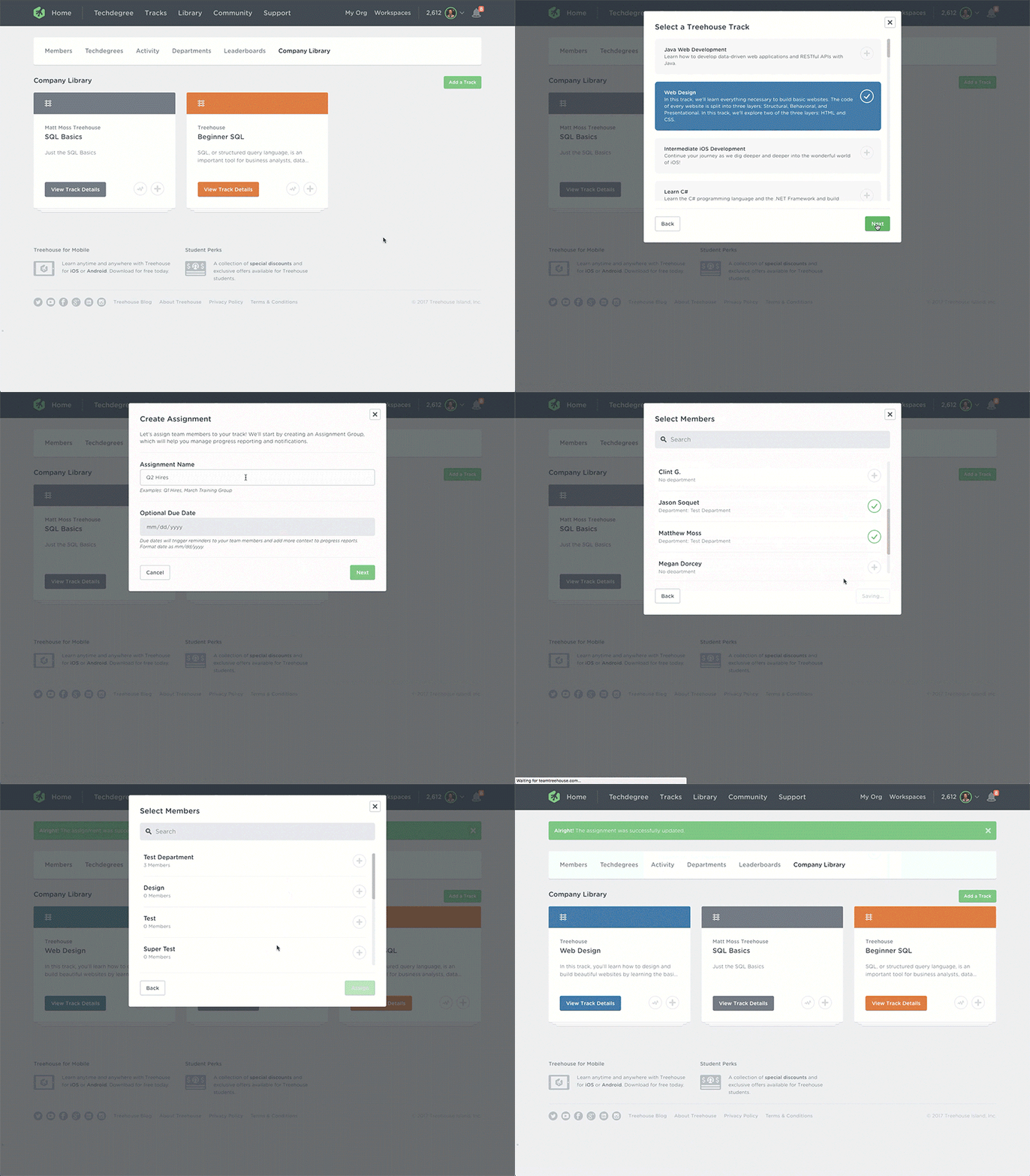
- Use GIFs to show product flows. When announcing a new product feature, it's often helpful to show how the feature works. Keep the GIF short so the file size is small. If a longer explanation is needed, use a video.
- Don't include meme GIFs. This makes Treehouse look unprofessional and the GIFs don't conform to our brand guidelines.
- Videos
- Use videos for campaigns or library content. Use videos produced by Treehouse. This can include campaign videos, teasers, course trailers, and the Dev Team Show.
Best Practices
Scaling
- Keep the aspect ratio. Don't warp the images. Constrain proportions to retain the aspect ratio of the original image.
Do - Constrain proportions

Don't - Stretch or warp

Size
- Make it retina-ready. Save images at 2x. This ensures retina-ready images. The images will be scaled down to fit. Full width images should be saved at 1200 pixels wide because their max rendered size will be 600 pixels wide. Inline images should be saved at 1032 pixels wide because their max rendered size will be 516 pixels wide.
- Keep image file size as small as possible. Large file sizes take too long to load. Compress images through a tool such as TinyPNG (actually accepts .jpgs as well as .pngs).
- Images should be wider than their height. Since the top portion of emails are the most important part of the email, it's important that images don't take up too much vertical space. Keep image height smaller than 516 pixels in height (rendered size; actual retina-ready size is 1032 pixels).
Do - Keep images short

Don't - Make images too tall

User Experience
- Provide a fallback for background images. Background images don't work in Microsoft Outlook or in Gmail, so provide a background color which is similar to the overall color in the image.
- Plan for text-only emails. Prepare for the emails to be viewed without images. Include alt text that describes the image. Clients such as Outlook, AOL, and Yahoo have images blocked by default, and in other clients users can turn this on in their preferences.
- Don't put text in images. Text is put outside images in order to gain control over readability at small screen sizes. Also, if the user has images blocked in their email client, then they'll miss out on seeing key copy.
- Make images link to the CTA when possible. If the image is associated with a CTA, make the image a link to the story-—not to the image itself. Images often take up a lot of real estate on the page, so make use of all that clickable space by including a link. People often instinctively try to click images, so make it easy for them to interact with the email.
Do - Plan for blocked images
Don't - Forget to add alt text
Do - Put text outside of images

Don't - Put text inside images

Full Width
Vocabulary
Full Width Image
Syntax
Full width photographs span the width of the white section.
Semantics
These are used when you want a section of content to stand out as a featured section.
HTML
<!-- // Card Item: Hero -->
<tr>
  <td class="esg-text-center" align="center">
    <a href="https://teamtreehouse.com" target="_blank">
      <img src="https://gallery.mailchimp.com/6cd557f316f6c6b5deccf9bc0/images/4b4a9744-5efb-47be-a341-978bfc6825ae.jpg" width="600" class="esg-round-t esg-image-full" border="0" alt="Typing on Laptop">
    </a>
  </td>
</tr>
</table>
<!-- // End Card -->
Inline
Vocabulary
Inline Image
Syntax
Inline images sit within the width of the white section, but show padding on the left and right side.
Semantics
These are used to reinforce or expand upon the supporting text.
HTML
<table class="esg-card esg-round" bgcolor="#ffffff" width="100%" border="0" cellpadding="0" cellspacing="0">
  <tr>
    <td>
      <a href="https://teamtreehouse.com" target="_blank"><img src="https://gallery.mailchimp.com/6cd557f316f6c6b5deccf9bc0/images/b689c535-f7ff-4550-b4f6-8f69b8f38633.jpg" width="516" class="esg-image-inline esg-p-b-3" alt="Typing on Laptop with Typewriter" border="0"></a>
    </td>
  </tr>
</table>
Attribution
Vocabulary
Attribution, Image Source, Image Credit
Syntax
Attribution lines sit below the right bottom corner of the image.
Semantics
Some images we use require attribution. The attribution line conveys the image source without competing with the other content in the email.
HTML
<!-- // Begin Card -->
<table cellpadding="0" cellspacing="0" border="0" class="esg-card esg-round" bgcolor="#ffffff" width="100%">
  <tr>
    <td class="esg-text-center" align="center">
      <a href="https://teamtreehouse.com" target="_blank">
        <img src="https://gallery.mailchimp.com/6cd557f316f6c6b5deccf9bc0/images/4b4a9744-5efb-47be-a341-978bfc6825ae.jpg" width="600" class="esg-round-t esg-image-full" border="0" alt="Typing on Laptop">
      </a>
    </td>
  </tr>
  <!-- // Begin Attribution -->
  <tr>
    <td colspan="2" class="esg-text-right">
      <p class="esg-p esg-m-t-05 esg-text-color-light esg-text-7 esg-text-right esg-m-b-0">Photo by Daria Nepriakhina / CC0</p>
    </td>
  </tr>
  <!-- // End Attribution -->
</table>
Photography
Vocabulary
Full Width Image
Syntax
Full width photographs span the width of the white section.
Semantics
These are used when you want a section of content to stand out as a featured section.

Choosing the Right Photography
- In-House Photography. We have some photography that has been made for us. If you need Treehouse employee avatar images for signatures or otherwise, they're in S3 (treehouse-email-images > templates > avatars).
- Stock Photography. Stock photography is another option.
- Creative Commons Photography. If using photos that require attribution, such as some Creative Commons photos, follow the attribution guidelines.
Illustrations
Vocabulary
Illustrations
Syntax
Illustrations follow Treehouse's Illustration Guidelines. They can be full width or inline. They're used full-width in featured cards, inline in regular cards, or as thumbnails in call out cards.
Semantics
Illustrations are best used to represent abstract ideas or metaphors. They also reinforce our brand.

Do - Background should have a monochrome color palette.

Don't - Background shouldn't have multiple hues.

Do - Shapes should be solid colors

Don't - Shapes shouldn't have borders

Do - Shapes should be round

Don't - Shapes shouldn't have sharp corners

Animated GIFs
Vocabulary
Animated GIFs, GIFs, animation
Syntax
Animated GIFs
Semantics
Animated GIFs are best used for product walkthroughs and special events or announcements. For the later, they should be produced by the Design or Motion department. Note: Create a fallback for non-supported animated GIFs. Be aware that some clients won't show animated GIFs. Instead, they only show the first frame, so make sure that image makes sense in your layout. Clients that don't support animated GIFs include Outlook (2007, 2010 and 2013) and Windows Phone 7.
Videos
Vocabulary
Video
Syntax
Videos appear in their own section, often with an accompanying title, description, and call to action.
Semantics
Our product largely uses video as a teaching mechanism, so video plays an important role in our communications as well. Short videos, such as video trailers or teasers are perfect for engaging our email audience.
Guidelines
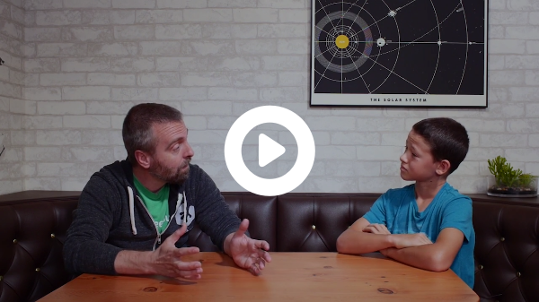
- Don't embed videos directly into emails. Embedded videos aren't widely supported across email clients. Instead, include a video still and then link that picture to the video so that the video plays in a new tab.
- Use linked inline image. Add the video still as a regular inline image and wrap it in a link to the video.
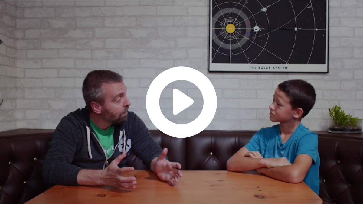
- Choose eye-catching video stills. Choose a moment in the video that features people (ideally - people are more attracted to images with people) or a catchy visual that represents the gist of the video. Don't choose a frame that includes text.
- Make it look like an app video. Video previews should look like the videos in the Treehouse library. Don't use video previews automatically generated by MailChimp or other ESPs. Use this Photoshop template to make the preview. You can use youtubescreenshot.com to easily generate a video still.
Do - Use the video preview template
Don't - Use another video preview tool (this is MailChimp's auto-generated one)
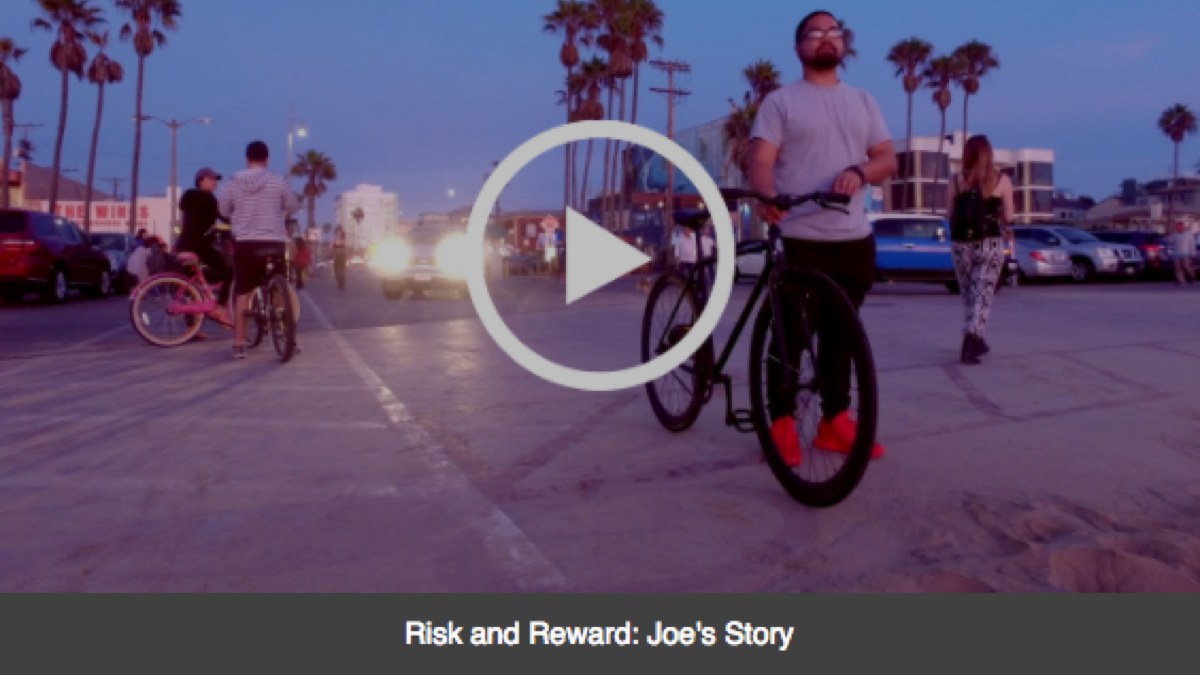
Do - Choose an engaging, text-free video still
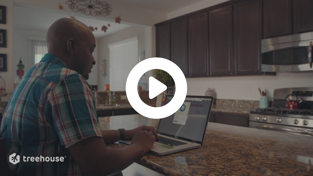
Don't - Use a video still that includes text

Icons
Vocabulary
Icons
Syntax
Icons appear in lists or alongside copy, in order to reinforce the meaning of the copy.
Semantics
Icons improve the scannability of the email, so users can get the gist of the email without having to read it too closely. They also help relate the email content to the library content by utilizing the same icons across both platforms.
Topics
Android
APIs
Business
C#
CSS
Data Analysis
Databases
Design
Development Tools
Digital Literacy
Game Development
Go
HTML
iOS
Java
JavaScript
PHP
Python
Ruby
Security
Virtual Reality
WordPress
Concepts
Accessibility
Analytics
Data Science
Settings
Events
Featured Student
Getting Started
Information Architecture
Inside Treehouse
Discover
Interviews
Kids
Learn To Code
Marketing
New Course
Announcement
Productivity
Project Showcase
QA
SEO
Profile
Learning
Gear Check
Tech News
Treehouse Show
Tutorial
UI
UX
Video Production

