Copy
Voice and Tone
There are major components that are important to keep in mind when writing copy: Brand Character, Tone of Voice, and Language. Each of these elements have an overall impact that can make content feel on or off brand. Use these collections of keywords to help guide marketing content.
Brand Character - overall impression we impart
- Friendly - A cornerstone of the Treehouse brand, this carries through for B2B
- Progressive - Forward-thinking, staying on the cutting edge of technology
- Trusted - Credibility, with no sense of skepticism
- Professional - Polished in a way that shows that we are experienced experts
Tone of Voice - mood and personality of our content
- Optimistic - Maintaining positivity, as opposed to emphasizing the negative
- Relatable - Approachable, not out of touch
- Informed - Awareness of what’s happening in the industry and world, having an opinion
- Mature - Refined, with a sense of ease and confidence
Language - deliberate word choice
- Effortless - Easy to read, not fussy
- Focused - Clear and concise
- Vibrant - Words that bring life and color
- Conversational - Natural, without formality
Writing Guidelines
- Use active voice Active voice is dynamic and confident. Avoid passive voice because it makes us sound uncertain.
- Write positively Use positive language rather than negative language. Learning how to code is a powerful, positive experience so we want our language to radiate positivity.
- Plan for a plain-text version Don’t assume that your images will be able to be viewed when users access your content on mobile. For example, the iPhone’s native email app will display images by default (and must be sized to retina standards to avoid blurriness/pixelation), but many other mobile email clients won’t. Plan for an “images off” environment by making sure your message is still being clearly conveyed if it appears without any accompanying images.
- Write conversationally Avoid tech jargon that alienates newcomers. One of our core audiences is beginners who are looking to transition into a new career. Make our interactions with them easy to for them to understand.
- Say more. Less words. The mindset most users have with email is to get in and get out as fast as possible. It’s important that we don’t add filler or fluff to our emails both in terms of design and content. The more we can say with fewer words, the more value the end user will perceive through the experience of reading our emails. Break up long sentences. Don’t use filler. Avoid overly descriptive or complicated words.
Audiences
Transactional vs. Promotional
- Transactional: Get straight to the point. Be factual, accurate, and succinct.
- Promotional: TBD
Personal Emails vs. Company Emails
Early on, choose which type of email is more effective and appropriate to send.
- Personal, text-only emails: These are text-only emails that one composes in the Treehouse Gmail account. They don't contain any designed email components. Go with this approach when you want to start a direct 1:1 conversation.
- Personal, designed emails: These are designed emails which include a signature molecule which contains the sender's photo and name. Go with this approach when you want to use the benefits of a designed email (rich, engaging content) but also want to give it a personal touch. This is great for newsletters or nurture emails where you want to routinely work on developing a relationship with a group of people.
- Company emails: These are designed emails which don't include a signature molecule. There intention is to inform the masses, and the expectation is that the recipient won't be responding to the sender.
Grammar and Mechanics
Content Types
Subject Line
- Make it catchy: Use an attention-grabbing yet clear subject line that captures what your email is about. Never use misleading subject lines.
- Keep it under the character limit: You can have as little as 27 characters that are displayed in a subject line depending on the platform. Use this wisely!
Preheader Text
- Utilize preheaders: Preheaders are the biggest missed opportunity in an inbox. It should support the message of the subject line and be considered an extension of it since it is viewed right alongside in an inbox. This can be “hidden” from view on the email template itself. Without a preheader, the default will be whatever is first in your email template. Big fails are “Logo” or "View in a browser."
Heading
- Capitalization: Only capitalize the first letter in the headline
Subheading
- Capitalization: Only capitalize the first letter in the headline
Body Copy
- X: x
Call to Actions (buttons, text links)
- Capitalization: Use title case for buttons and links
- Placement: CTAs should be prominently placed, either at the top or center of the email. A traditional “fold” doesn’t really exist anymore, but just keep in mind that you’ve only have about 8 seconds to grab a reader’s attention, and even less with business customers (time is money!).
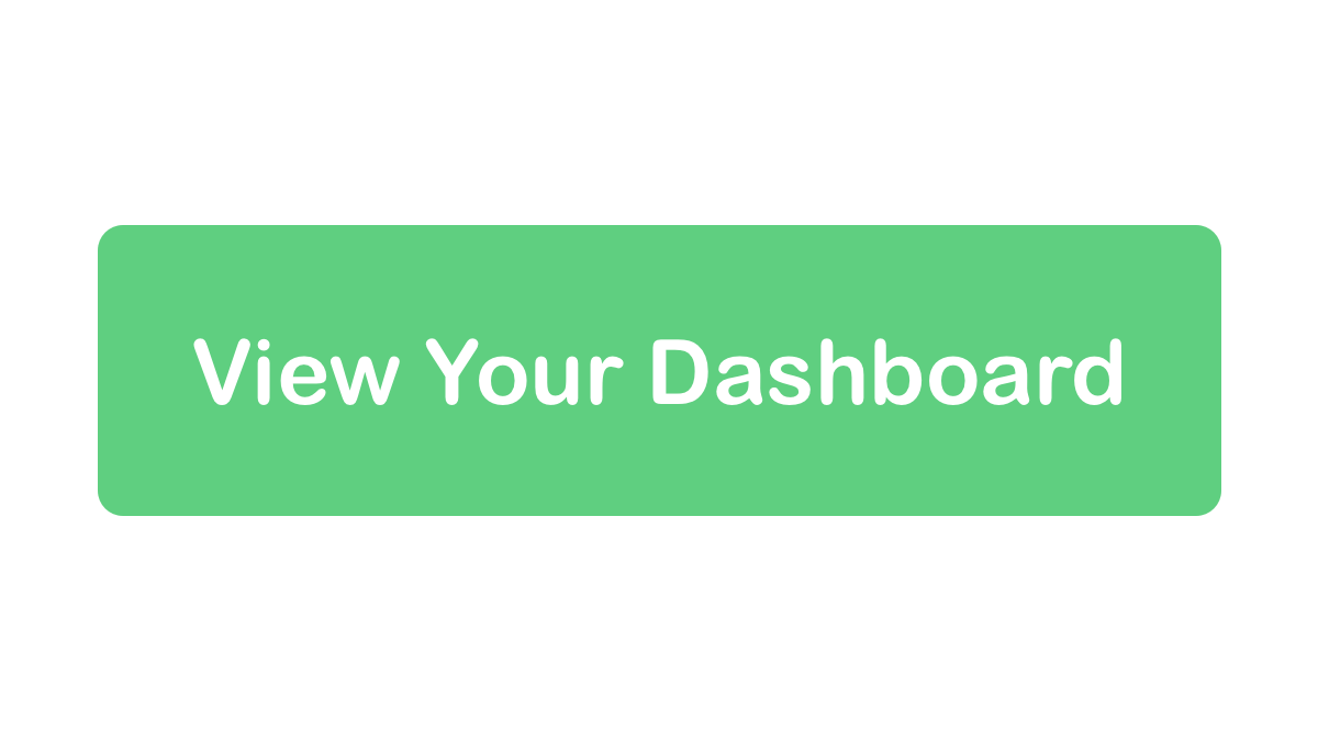
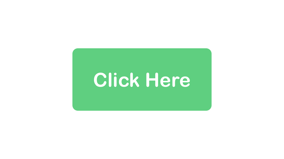
- Call them to value: Make sure the CTAs don't just provide an action, but attempt to engage the user. Don’t simply put “click here” in a CTA. Describe the action, or intent of the link ala “Explore our the Treehouse Roadmap” or “Learn how to build an app.” The more engaging and inviting they are, the more effective they will be.
- CTA buttons: Keep it brief--2-3 words is ideal. The button should visually stand apart from the rest of the email copy (while still adhering to company branding and color palette).
- Secondary CTAs are A-ok: Sometimes you have to offer an alternative action to your recipients. For example, they may not be ready to “Download Now”, but you can get them to “Check out product specs.” Just make sure your primary CTA is visually emphasized over the secondary CTA.
Do - Be specific
Don't - Write generic CTAs
Lists
- X: x
Signature
- X: x
Accessibility
Alt Text
Alternative Text, often referred to as simply Alt Text is a descriptive word or phrase that that is inserted as an attribute in an HTML document to explain the contents of an image. In the case of an abstract image or illustration that displays a concept or function, it's best to relay that concept instead of a narration of what's actually rendered. The Alt Text appears as text in an empty box. Images should be added with intention, and therefore they enrich the accompanying text. So, it's important to be able to translate the purpose of those images to everyone.
The importance of Alt Text
- Assistive devices rely on it: For those who use screen readers, it makes the email more accessible since it gives them access to the function of the images.
- It's a backup for when images aren't loaded: When images fail to load, it could be because the image link was broken, the user is experiencing network connection problems, or because the user/email client has prevented images from being displayed. In those cases, Alt Text is displayed in place of the image.
Guidelines
- Keep it short: The length should ideally be a word or two, and less than one sentence. Keeping it short makes it easy to read and is less likely to break the email's layout. Additionally, some email clients won’t display Alt Text that exceeds the image width.
- Don't use quotes: Adding quotation marks will cause the HTML to break.
- Test it: When testing, disable images to find out how your Alt Text will display.
Word List
These words often written differently. Here's how they should be written:
- Techdegree - not TechDegree
- Front-end - not Frontend or Front end or Front End
Words to avoid
These words often written differently. Here's how they should be written:
- Tech jargon: disruption, thought leader, bleeding edge, cutting edge, evangelist, paradigm shift
- Overly Aggressive phrases: crushing it, killing it
- Non-inclusive descriptors of people: crazy, insane, ninja, rockstar, wizard, unicorn, words which describe a person's age (young, old, elderly, etc.), bro, guys (when referring to a mixed gender group)
Timing and Frequency
Timing
This really depends on the audience.
- For B2B customers: The email should fall in their inboxes between the hours of 10am-2pm local time. Most week days are fine, but experience Mondays and Fridays aren’t great. Never send a B2B email on a weekend.
- For consumers: Most consumers are on their phones checking email constantly throughout their day. Depending on the demographic of your audience, try to alter your send times to accommodate what you believe to be routines.
- Test the timing: Testing should be done of the audience before setting a permanent email delivery schedule.
Frequency
- Don't overwhelm: Campaigns often benefit from having a series of strategically timed emails. However, be mindful of spacing out the emails so enough time passes in between emails and the user doesn't feel overwhelmed by emails.